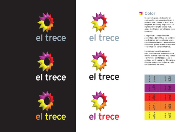
C&G Partners has created a logo designed to be in continuous movement. The original logo for Argentinian broadcaster Artear was designed in 1994 by C&G Partners’ Steff Geissbuhler with Henricus Kusbiantoro at Chermayeff & Geismar Inc. Like the flag of Argentina, the original logo was inspired by the Argentinian sun, but made of interlocking elements around an open center. In the ensuing years, Artear grew to operate numerous channels and cable stations, and needed a new brand architecture for all their properties. Time had also come to change the official name of the flagship, Canal 13 (Channel 13), to its nickname, El Trece (The Thirteen). Artear returned to Steff in 2008 for some new thinking, a refresh of the brand identity and a new brand architecture for their many subsidiaries. Because most people experience the identity during a broadcast, not in static form, the reinvented mark was built to be in continuous, elegant motion. First, a three-dimensional take on the original mark was modeled:
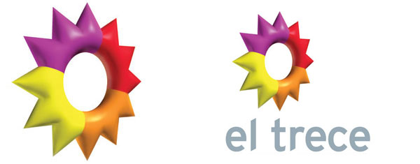
(For the new name of the main channel, the typeface Interstate is used, inspired by the points and angles of the rays of the symbol. Look closely and you will notice that the symbol balances delicately atop the letter “t”.) The model was then animated, and programmed to continuously revolve like a spinning coin whenever it is visible during broadcast:
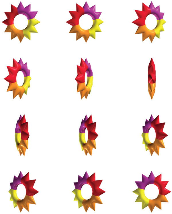
For any necessary static applications, the symbol is shown frozen in mid-turn, literally a still from the animated version. Graphic guidelines in Castillian Spanish were also created to help Artear manage its complex brand across all its new properties: