Among the many financial services mergers to take place in 2009, the combining of Morgan Stanley and Smith Barney in early summer created an industry-leading global wealth manager with over 1,000 branches in the United States and significant international presence. The debut of this combined financial entity was rolled out with its new brand identity, created by C&G Partners.
![]()
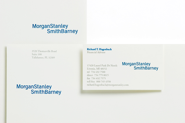
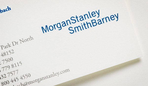
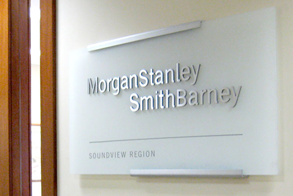
The new design focuses on custom-drawn serif letterforms that communicate newness while acknowledging the heritage of both firms to ensure familiarity. The staggered configuration of the names signals a new forward direction as well as the inevitable coming together of two great firms.
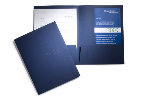
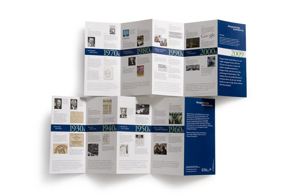
The new brand identity has been extended to all print and digital marketing communications, including launch kit, brochures, web portal and a comprehensive signage system.
The new brand identity marked a full circle for C&G Partners’ Steff Geissbuhler, who decades earlier had custom drawn the Morgan Stanley word mark. This time around, a new set of challenges were generated by being in the midst of a major recession. These included the need to seamlessly weave together in graphic form the prestige of Morgan Stanley with the warmth and humanity of Smith Barney, to give equal weight to each company’s name through a design that could be easily applied to a broad range of brand applications, and to convey solidity through a subtle evolution of the mark that would nonetheless result in a distinctive, differentiated identity.