The Nonprofit Finance Fund, a national leader in financing nonprofits, has recently unveiled a new brand identity, designed by C&G; Partners. The new identity system reframes how funders, nonprofit organizations and those they serve can work with NFF to achieve optimal financial and operational health, and drives home the connection between an organization’s mission and the practical needs required to fulfill it.
![]()
NFF approached C&G; Partners with the need to clarify the value they bring to nonprofits and help audiences understand how to reap the full benefits of NFF’s lending program and financial tools so that organizations can focus on realizing their mission and serving their communities. In response, CGP moved NFF away from its dark blue and mustard green logo, consisting of three lowercase initials, toward the use of the full name accompanied by a new symbol and evolved tagline that express the interdependence between money and mission.
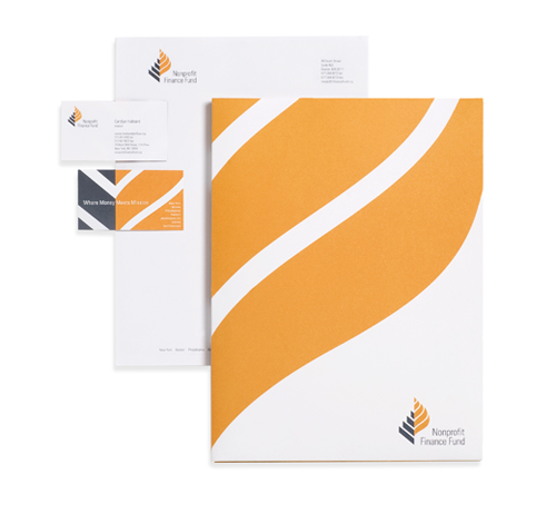
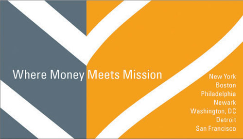
“The new look and feel of the brand is a rite of passage for an organization: a fundamental strategic investment in identity, consensus and communication,” said NFF President & CEO, Clara Miller. “Our process with C&G; Partners engaged a range of voices in defining the right vocabulary, distilling many points of view toward an essential value proposition, aligning these pieces, and expressing them in color, motif, and words.” To design the new logo, CGP addressed several key communication challenges, the primary one resolving the seemingly contradictory relationship between “nonprofit,” “finance” and “fund.” Partner Steff Geissbuhler responded to this set of dualities through a reconfigured name that alters the emphasis of the words, accompanied by a symbol that connects two seemingly disparate shapes—a cool, dark gray, pyramid and a soft, warm, undulating flame—which refer to the organization’s expertise and mission. The distinction between the two sides is reinforced in the new tagline: Where Money Meets Mission. “The new identity needed to establish a link between the organization’s analytical, strategically focused, financial expertise and its warm, humane, aspirational culture,” explained Leslie Sherr, Director of Brand Strategy.
The result is a distinctive mark that breaks with many of the standard visual codes and cues of the financial services sector such as serif typefaces, blue-and-green color palettes and iconography like animals, mountains and other explicitly nature-based imagery. The new symbol has a bold simplicity with carefully defined alignments between the name and the mark that reflect the level of attention to detail one expects from a financial advisor.