How do you make a university welcome center inviting, inclusive and accessible to the deaf community? This was our challenge when designing the visitor experience of the newly unveiled Maguire Welcome Center at Gallaudet University (GU), a premier institution of learning, teaching, and research for the deaf and hard-of-hearing. For the project, C&G Partners worked in collaboration with the university and Dangermond Keane Architecture to create a visitor experience specifically for “deaf eyes.” You can read the press reviews on Graphic Design USA and SEGD.
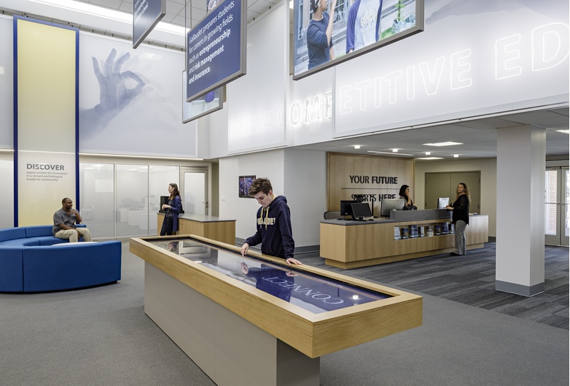
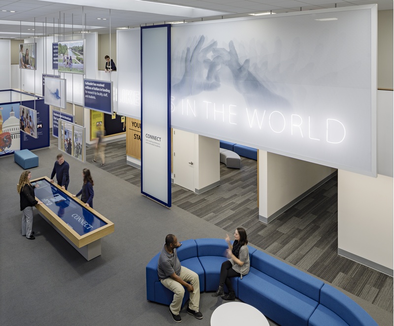
The newly opened state-of-the-art, multimedia-enhanced facility in Washington, D.C. serves as a gateway to GU the world’s only university designed to be barrier-free for deaf and hard of hearing students, for thousands of students and annual visitors such as prospective students and their families. To create a successful project, C&G immersed themselves in the culture of the deaf community. The firm’s experiential designs for the Maguire Welcome Center are based on the DeafSpace Guidelines established by Hansel Bauman, executive director, Campus Design and Construction at Gallaudet University and the founding partner of Hansel Bauman, Architect + Planner—a recognized leader in the field of DeafSpace architecture. DeafSpace Guidelines include more than 150 distinct design elements that address the five major touch points between deaf experiences and the built environment: space and proximity, sensory reach, mobility and proximity, light and color, and acoustics. Becoming familiar with DeafSpace principles, as well as aspects for American Sign Language (ASL), enabled C&G Partners to apply their expertise in design to the unique needs and culture of the deaf community.
DeafSpace Guidelines include more than 150 distinct design elements that address the five major touch points between deaf experiences and the built environment: space and proximity, sensory reach, mobility and proximity, light and color, and acoustics. Becoming familiar with DeafSpace principles, as well as aspects for American Sign Language (ASL), enabled C&G Partners to apply their expertise in design to the unique needs and culture of the deaf community. Inspired by DeafSpace Guidelines, the design studio created unique artworks in ASL that portray the GU tagline: Welcome, Connect, Discover, and Influence. To create the graphic artwork for the word “Connect,” each of the 40 hand movements used to sign the word were individually photographed, masked, and overlaid to create a single image that represents the complexity, fluidity, and movement at the heart of sign language. The digitally-layered images were created in a style reminiscent of pioneering English photographer Eadweard Muybridge, whose early scientific experiments used the camera to sequentially record motion.
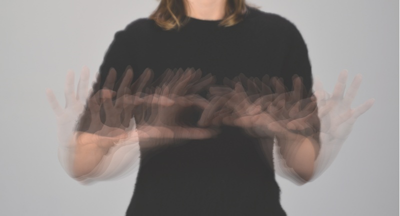
These images were printed on scrims in a variety of sizes, some as large as 10 feet by 30 feet. To ensure optimum legibility and visibility, the layered photographic images were converted into graphic art made of exaggerated halftone dots. Translucent scrims are “tuned” to the level of a daylight-filled room to promote visibility and avoid eye fatigue that can lead to a loss of concentration. According to the DeafSpace principles, a soft, diffused light “attuned to deaf eyes” is essential.

For similar reasons, C&G Partners illustrated GU’s branded slogans through large decorative, neon friezes. Phrases including “there is no other place like this in the world” and “gain a competitive edge with global opportunities” are rendered in neon tubes that fuse legibility and visual clarity. A double-sided lightbox installation, foregrounding GU communications material, is suspended from the ceiling in the form of an informational chandelier. All design elements, including other exhibition features such as an interactive table, map, iPads and banners were created with a focus on inclusivity, accessibility and creating a barrier-free space for shared experiences. This was accomplished by a strong focus on sign legibility through typography size, height, weight, and line spacing, as well as a focus on high contrast. C&G Partners also worked on the exterior signage for the on the project.
All images courtesy Lincoln Barbour.