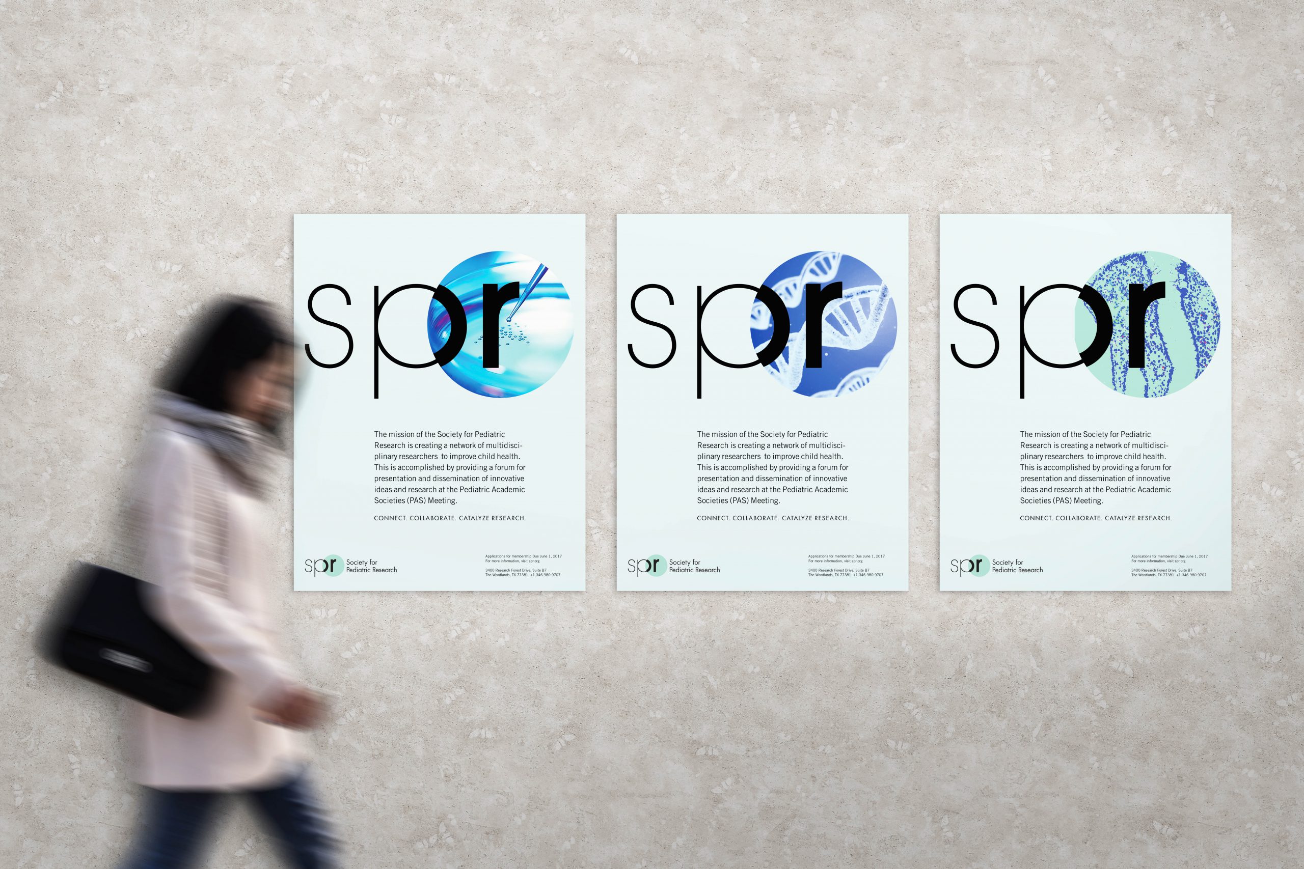
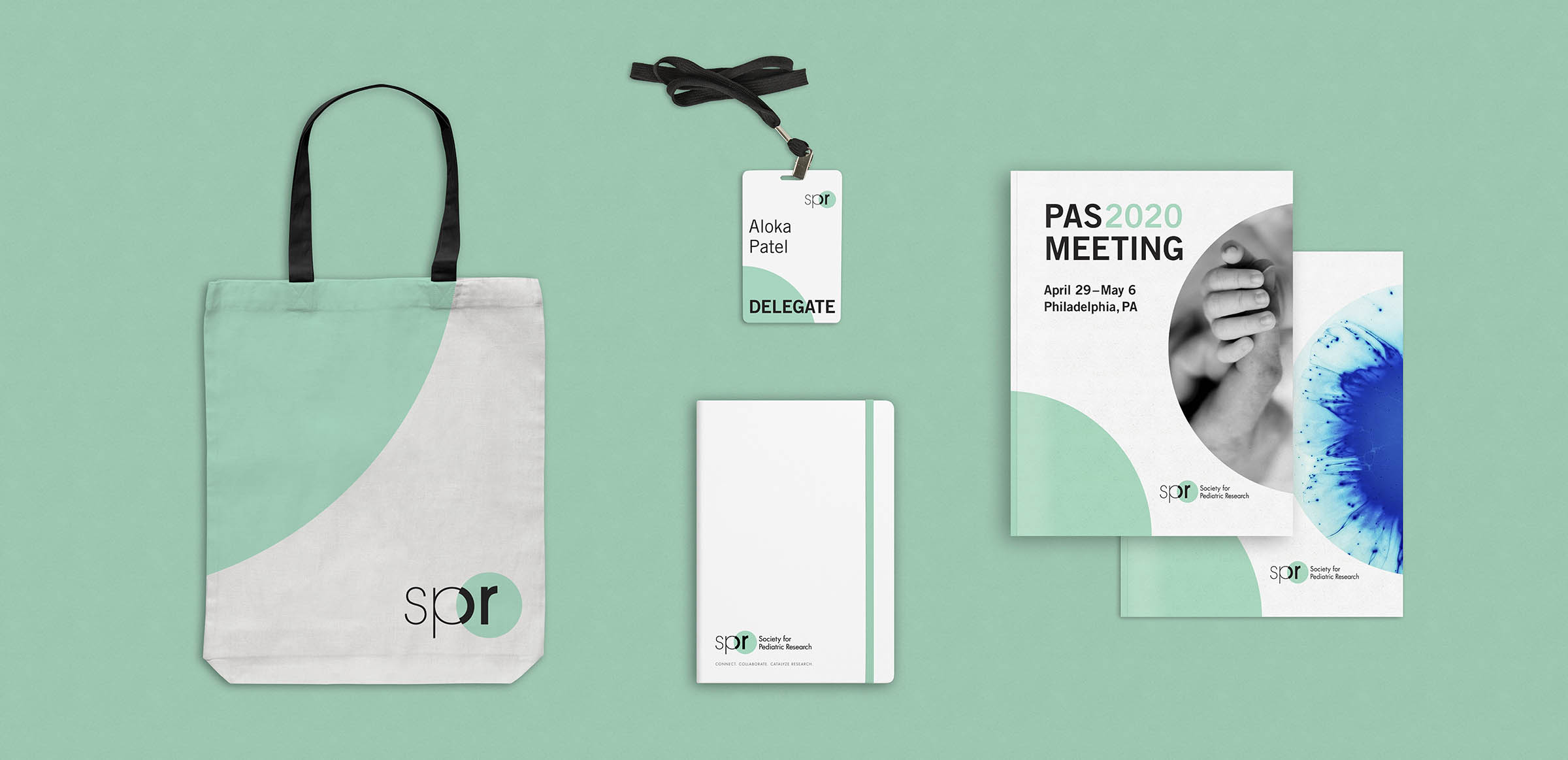
A lowercase logo, with a lens magnifying the "r" of research, for an organization creating a research network to improve child health.


The mission of the Society for Pediatric Research is to create a network of multidisciplinary researchers to improve child health. Built with an acronym, circle, and type, the organization’s visual identity echoes its vision of connecting, collaborating and catalyzing the conduct of pediatric research. Elements have been carefully chosen to work together: the seafoam green used in the circle of the logo mark is fresh, modern, and evokes both research and medical care; the Futura typeface is a classic sanserif typeface from the modernist era, and fits SPR’s innovative, research-oriented mission.
![C&G Partners [logo]](https://www.cgpartnersllc.com/wp-content/uploads/2022/07/CGP_Logo-black.png)