A new identity for an organization fighting for women’s access to higher education since the late nineteenth century.![]()
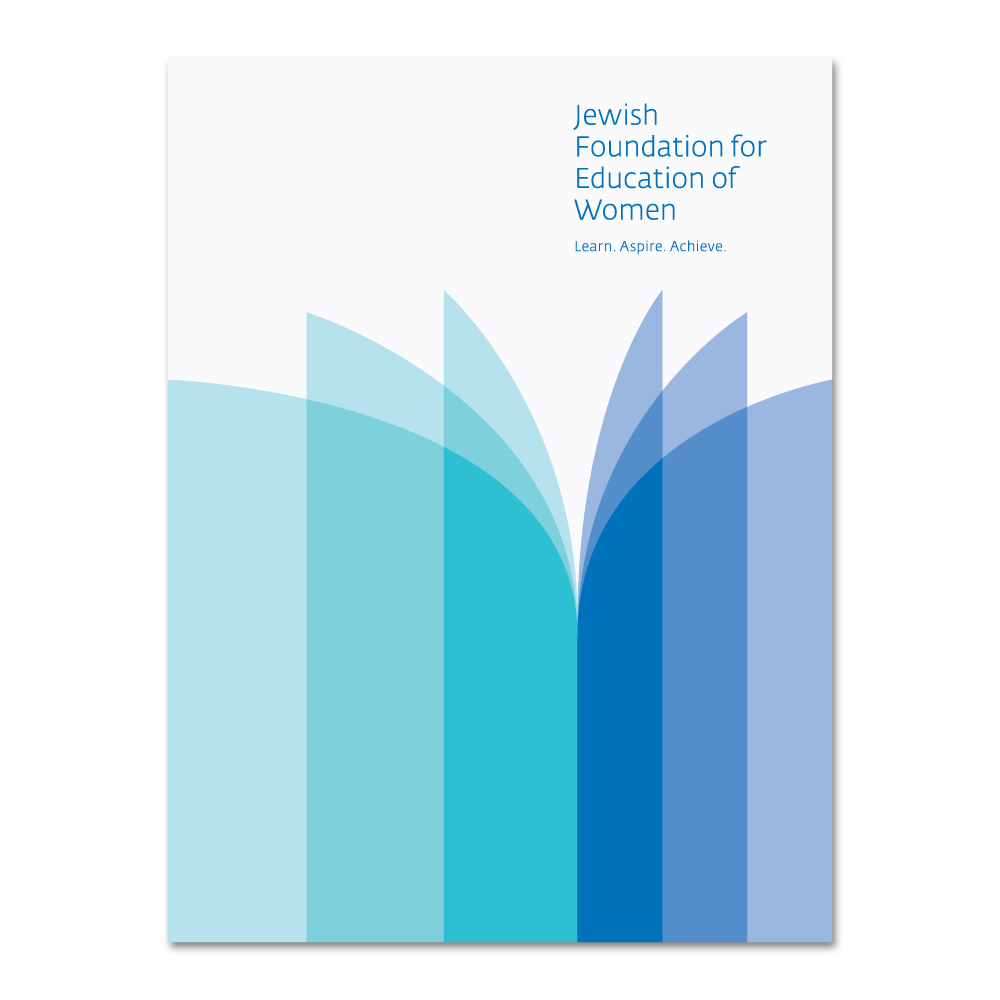
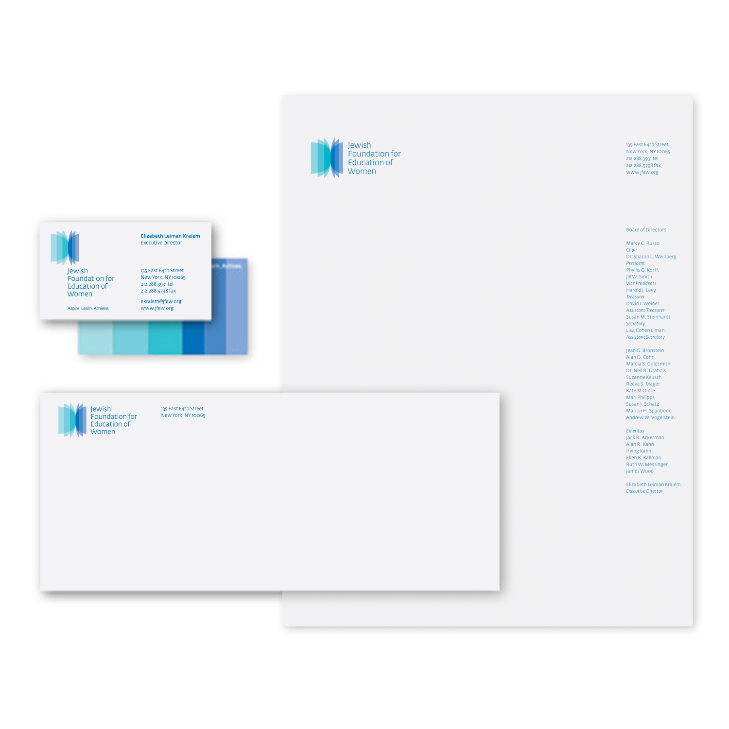
The Jewish Foundation for the Education of Women sought a new logo that would bring emotional significance to JFEW’s story and contributions to women in the workplace during the 20/21st century, elevate JFEW’s profile and expand its recognition among academic institutions, nonprofits and JFEW alumni. Following the creation of a new tagline—Aspire. Learn. Achieve.—the name was reconfigured into a stacked arrangement using Fedra Sans to provide a simple, informal elegance. This arrangement helps to break up the long name and balances the new symbol that was created to suggest movement and passage, akin to an educational journey that leads to a professional career.
The symbol also expresses turning pages of a book and the soft petals of a flower, or wings of a butterfly. The two blues and tints, created through overlaps, express a cool and sophisticated transparency and feminine elegance.