![C&G Partners [logo]](https://www.cgpartnersllc.com/wp-content/uploads/2025/09/CGP20_black_orange_RGB.png)

Established over 70 years ago, The Teagle Foundation advances liberal arts education through knowledge-based philanthropy. To create an effective rebrand and website, C&G Partners needed to illustrate the Foundation’s work at the intersection of traditional academic values and future-forward problem solving for the liberal arts.
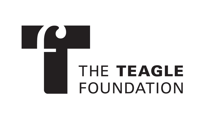
Teagle’s updated logo combines a sans-serif uppercase ‘T’ with a lowercase serif ‘f’. The intersection of the two forms speaks to the past and future. The two styles reference the multiple intersections inherent in the liberal arts: humanities / sciences, classic / avant-garde, analogue / digital. The lower-left corner of the ‘T’ is rounded, where the serif of the ‘f’ intersects it.
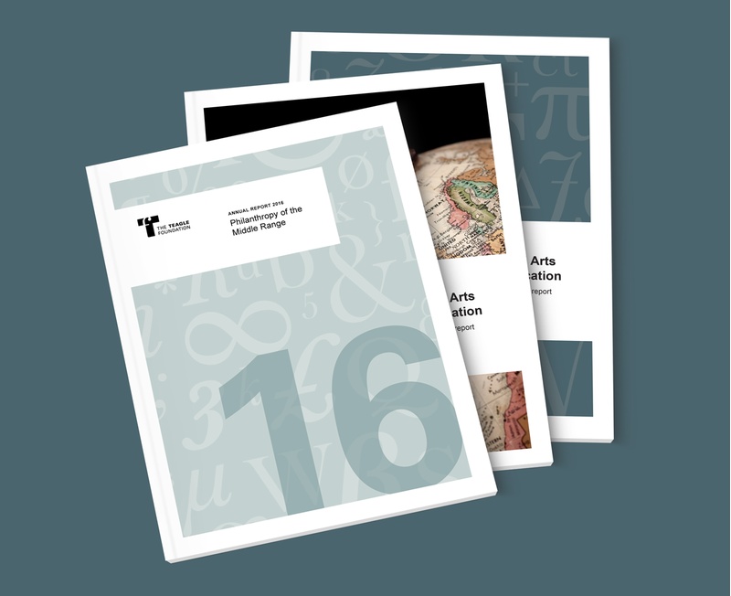
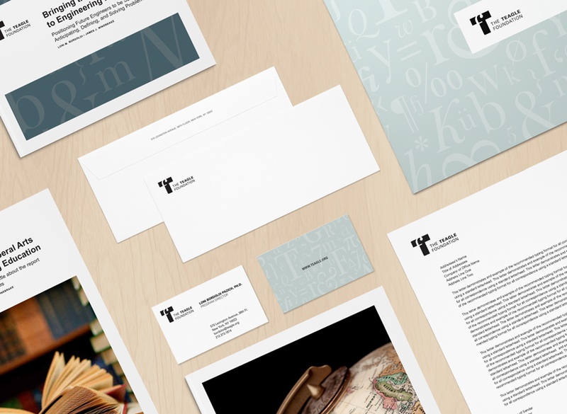
To accompany the mark, C&G created a serene set of patterns based on language and notation. Letters, numerals, and symbols represent different facets of the liberal arts.