![C&G Partners [logo]](https://www.cgpartnersllc.com/wp-content/uploads/2025/09/CGP20_black_orange_RGB.png)

A logo that suggests movement and ascent for one of the top 10 small libraries in the nation. ![]()
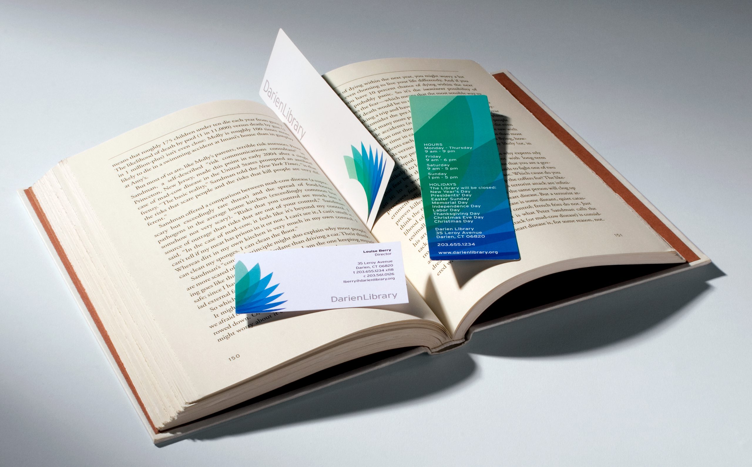
A recipient of the Connecticut Award for Excellence in Public Library Service, the Darien Library ranks among the top 10 small libraries in the nation. Over time, the library experienced such an increase in the breadth of its services that the current location was no longer able to meet the needs of the town, where 95% of the residents hold active library cards. The Library embarked on a long-range planning process that revealed the need for a new library. The Library embarked on a capital campaign and took the opportunity to rethink its brand identity. A primary goal was to graphically convey the library’s emphasis on “extreme customer service” while cultivating an awareness of its collections, services, and programs for all ages. The Yankee culture of the town in combination with the spirit of the library necessitated an identity that would be timeless yet also flexible enough to accommodate continuous advances in technology, service, and media. Several visual directions were explored relating to water, wildlife, initial letterforms, and, of course, books. The final solution resulted from the simple act of flipping the pages of a book interpreted through a progression of transparent color tints. The logo also refers to a wave, leaves or the wing of a bird, all suggesting movement and ascent.