![C&G Partners [logo]](https://www.cgpartnersllc.com/wp-content/uploads/2025/09/CGP20_black_orange_RGB.png)

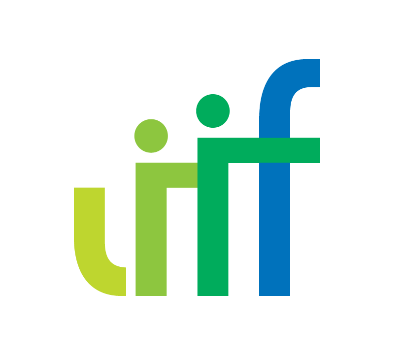
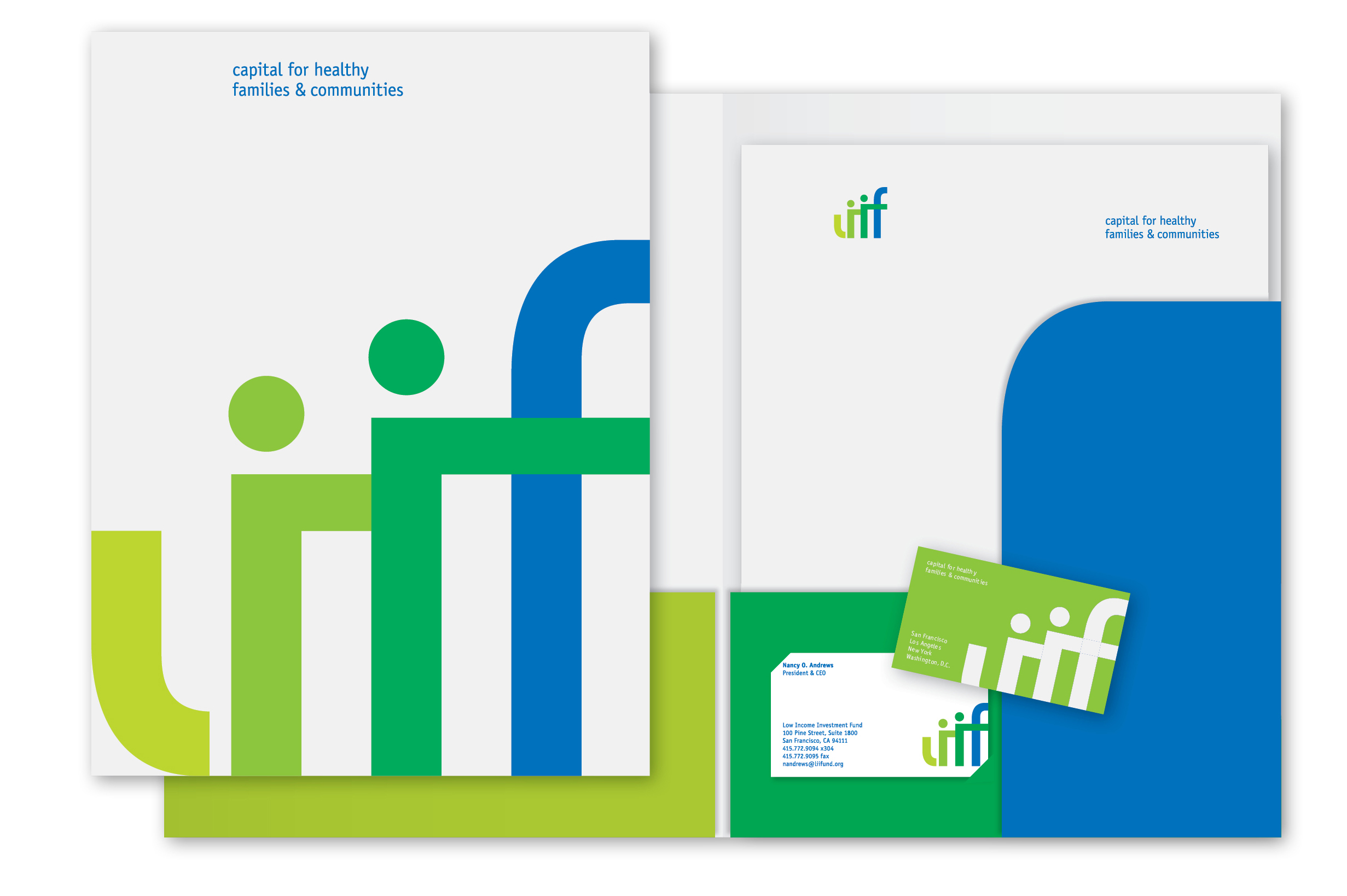
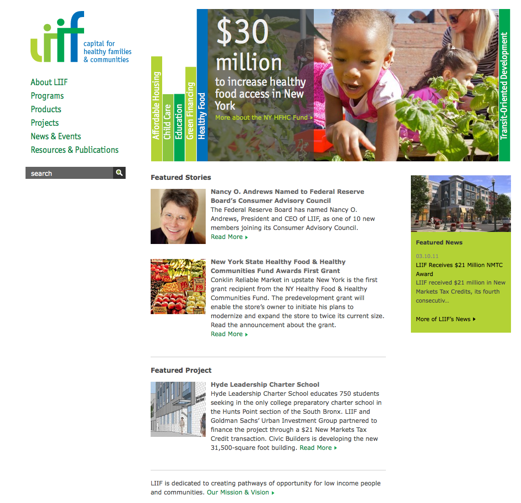
When it comes to creating meaningful opportunity for low-income people and communities, few non-profits have achieved as much as the Low Income Investment Fund. To give them a brand identity on a par with their achievements, while sublimating the “low” in their name, a new logo was designed based on their initials, then attached to a tagline that clearly states their benefits. To express growth plus the stability essential to the financial sector, a green to blue color palette was chosen. The sans serif letter forms rise in an upward progression from light yellow-green to dark blue to convey growth, while the dots and connecting crossbars reinforce support for individuals and families. For continuity with collateral items, the color scheme and logo elements were applied in playful ways to stationery items and folders.