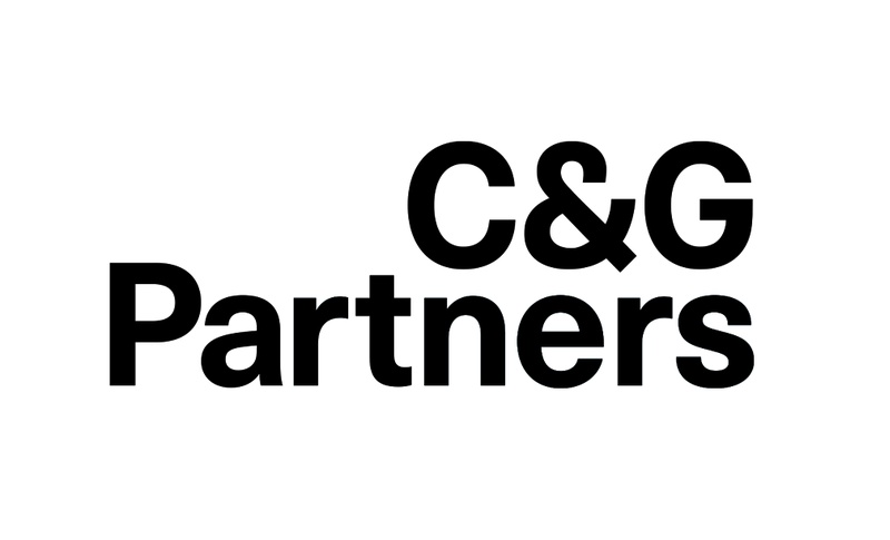
Entering our second decade of helping our clients define their brands, C&G Partners is excited to announce today a redesign of our own brand identity and a new firmwide mission. Starting with our new logotype, the identity is purposely straightforward, highly legible, makes better use of space, and is designed from the start to be a digital native.
Neue Haas Unica, by Monotype’s Toshi Omagari, forms the basis of the refresh. The typeface is a modern revival of Unica, a “lost” typeface from the late 20th century originally created as a hybrid of Helvetica, Univers and Akzidenz Grotesk. “I think of Unica as a kind of zen version of Helvetica,” says Maya Kopytman, a partner at C&G. “It’s soothing, with a calm, even texture. It has the modernity of a classic, mid-century sans-serif, but at the same time it also has a humanistic, less corporate feeling. We’re thrilled to wear it as we go into our second decade.”
 The typeface’s classic yet fresh presence fits the spirit of our creative practice. Our logotype has a number of customizations that we made to the letterforms, from edits to the ampersand to adjustments within counters and apertures.
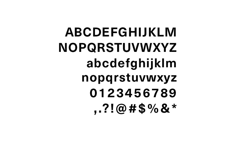
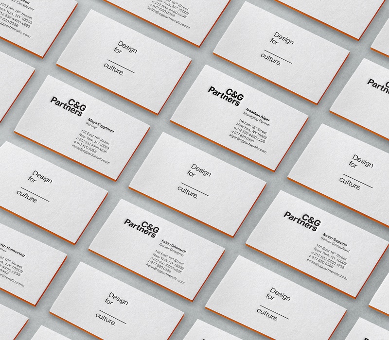
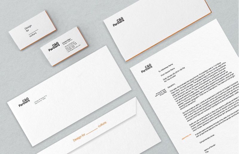
C&G orange is now officially our brand accent color (black and white are the primaries so our client work always takes center stage), but now orange has a more mischievous role. Rather than being applied in large blocks of color, or in the logotype itself, it prefers to hide somewhere nearby in plain sight, ready to be found once you know the game.
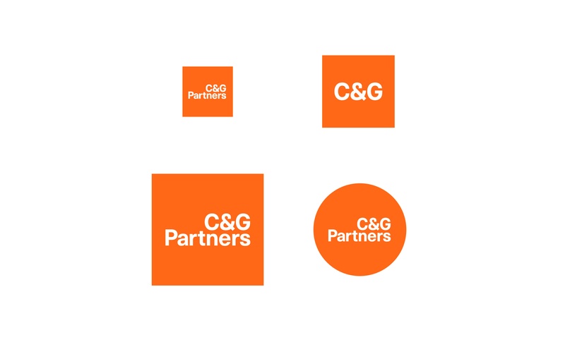
Legibility for social media badges and favicons was one of the driving forces for the redesign. Among the new mark’s compositional quirks is that it appears flush right but is left-aligned to the page.
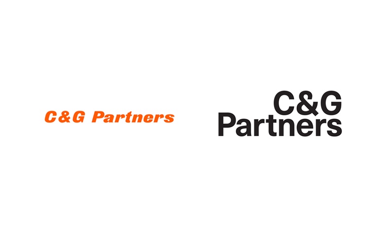
Our previous logotype, set in Derek Italic, will be retired after years of service, and replaced by this new identity for our next decade.