![C&G Partners [logo]](https://www.cgpartnersllc.com/wp-content/uploads/2025/09/CGP20_black_orange_RGB.png)

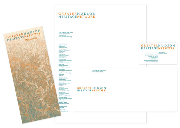
C&G Partners has created a new brand identity for the Greater Hudson Heritage Network, an organization for heritage professionals. The mark projects both the historical nature of the membership and the future potential of the organization. As requested by our client, the logo also deliberately avoids overused regional imagery and colors: no river, no boats, no waves, and no maps of New York State.
![]()
The design team explored a range of icons, insignia and symbols, and came to the conclusion that a wordmark was the most appropriate way of communicating the name. The four words are typeset to be the same length, and arranged to read both as the full name and as the secondary vertical pairings ‘Greater Heritage’ and ‘Hudson Network’. The final colors, a warm burnt orange and a cool blue-grey, were chosen for their relationship to woods, bricks and oxidized copper, and for their equal contrast values.
Partner Steff Geissbuhler, who led the design effort, previewed the new mark at the “Ready? Set? Brand!” session of the recent annual conference of the American Association of State and Local History (AASLH) in Rochester. The session explored name change as a deliberate strategy for revitalizing an institution.