![C&G Partners [logo]](https://www.cgpartnersllc.com/wp-content/uploads/2025/09/CGP20_black_orange_RGB.png)

HHMI (the Howard Hughes Medical Institute) is a science philanthropy advancing basic biomedical research and science education for the benefit of humanity. C&G Partners has been working with HHMI on a number of projects, including new campus signage for their headquarters and conference center in Maryland. The new installations bring the organization’s multicolor visual brand to life, give the verdant grounds a stronger identity, and relate to the plantings and foliage all around.

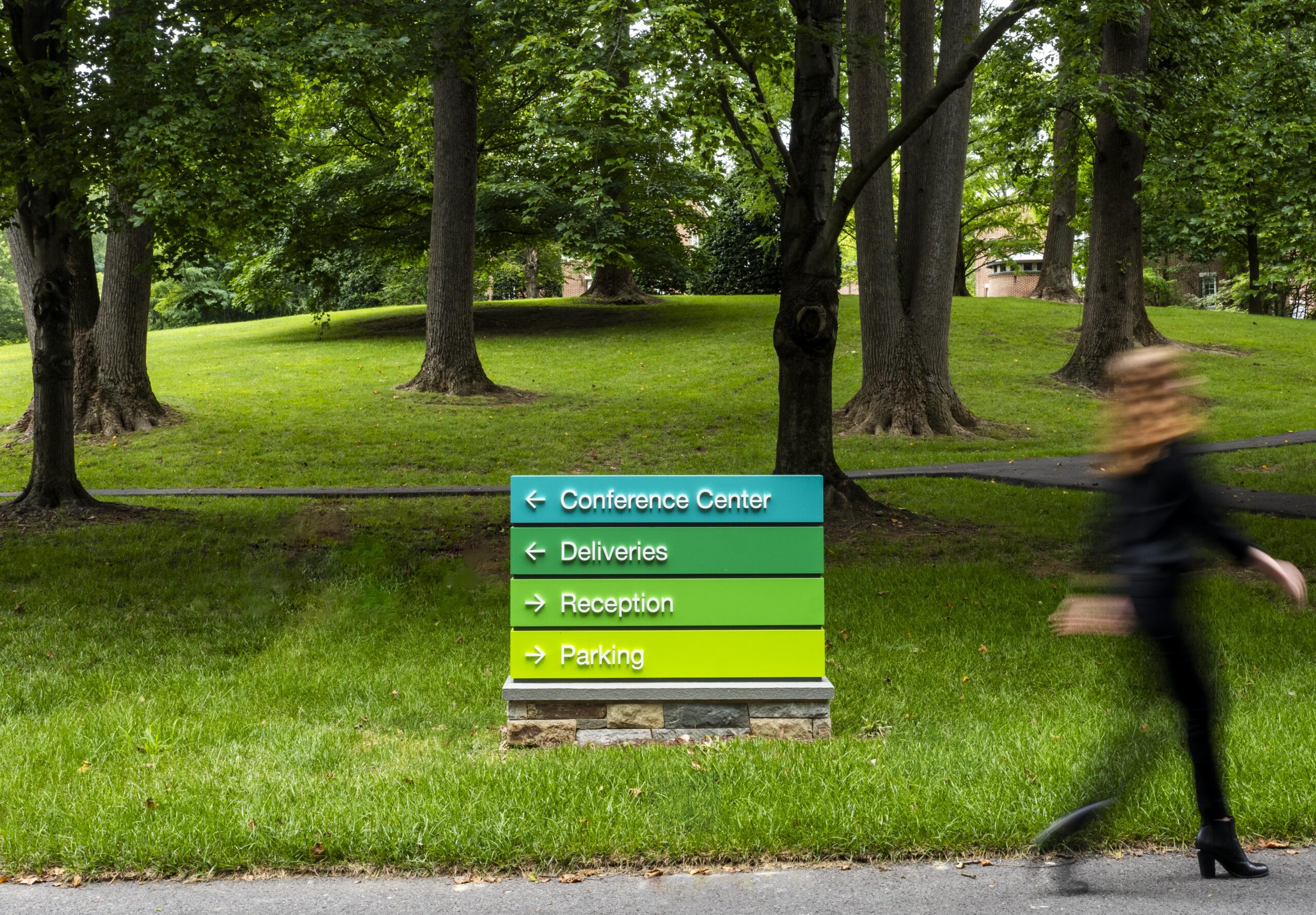
The institution’s visual brand uses four colors simultaneously, either in the form of a gradient of all four, or as four individual colors. The exterior signage embraces this unique tonal scheme, stacking them vertically to give the optical sense that they are rising out of the plantings nearby.
The new signage lies lightly on the land, positioned to be clearly seen, but never upstaging the natural context. Emphasis was placed in the design process on creating highly legible typography, visible to first-time drivers on the campus in all weather conditions.
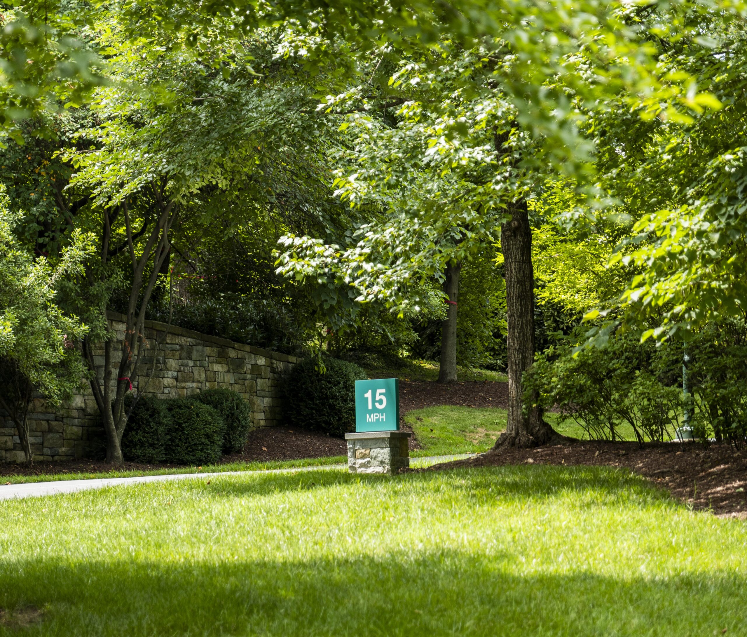
All of the signage is set on plinths of rusticated stone with a refined capstone, echoing the low stone walls that define the perimeter of the campus, and the stone of the buildings that occupy it down the road.

When a single color is used, it is the primary teal that visitors will have seen, on the HHMI website and publications, as the most common color of the four.

The visual presence of the signage is clean and minimal, but a host of refined details and construction methods must be used to create what appears to be a simple look. Masonry and steel joint alignments are just one of many small details that bring the signage to life upon closer viewing.

From a distance, the signage forms and method of stacking the brand colors make these manmade shapes seem to rise up out of their natural context.

The campus headquarters signage is one of a number of projects underway by C&G Partners for HHMI.