![C&G Partners [logo]](https://www.cgpartnersllc.com/wp-content/uploads/2025/09/CGP20_black_orange_RGB.png)

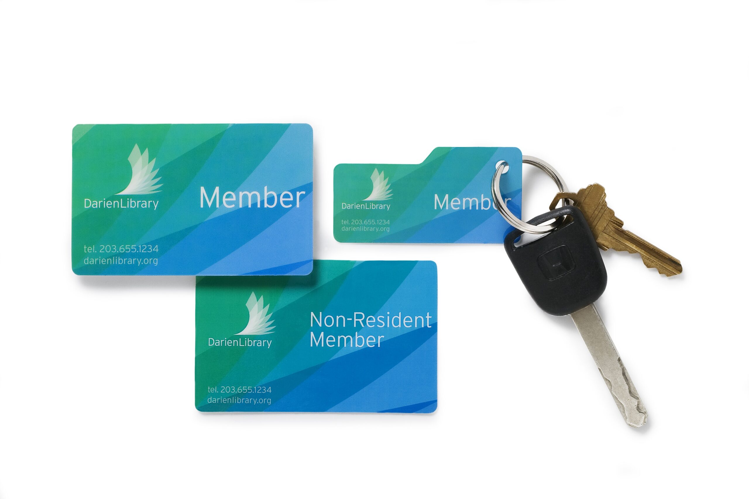
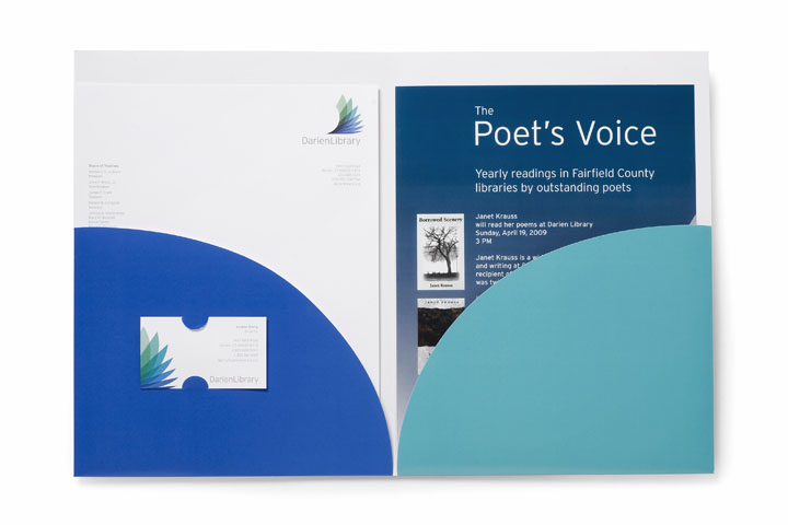
As part of a new main library building and capital campaign, Darien Library retained the firm to design a new identity and print campaign. The logo refers to a wave, leaves or the wing of a bird, all suggesting movement and ascent.
![]()
A primary goal was to graphically convey the library’s emphasis on “extreme customer service” while cultivating an awareness of its collections, services and programs for all ages.
The Yankee culture of the town in combination with the spirit of the library necessitated an identity that would be timeless yet also flexible enough to accommodate continuous advances in technology, service, and media.
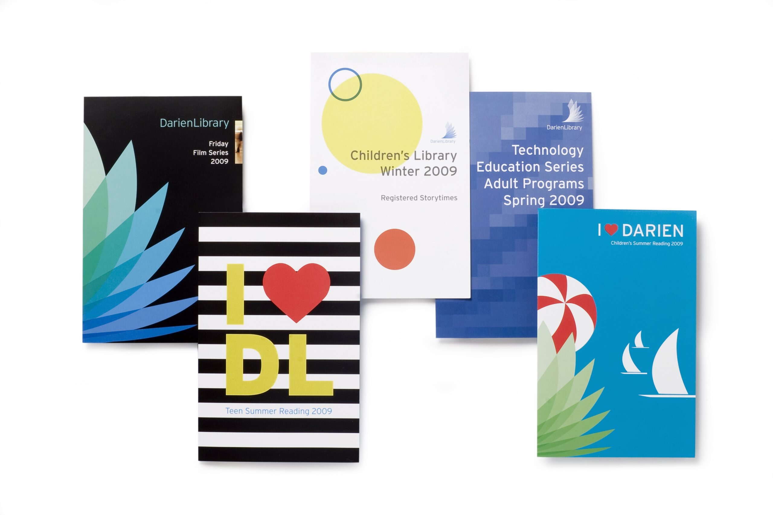
Several visual directions were explored relating to water, wildlife, initial letterforms and, of course, books. The final solution resulted from the simple act of flipping the pages of a book interpreted through a progression of transparent color tints.