![C&G Partners [logo]](https://www.cgpartnersllc.com/wp-content/uploads/2025/09/CGP20_black_orange_RGB.png)

How can brand identity help drive a growing mission? C&G worked with our longtime client The Teagle Foundation to develop a pair of new brand identities for programs promoting the liberal arts. The brand identity pair work as a family, neither identical nor completely different.
For their new Cornerstone project, which works to support and strengthen liberal arts education, Teagle partnered with the National Endowment for the Humanities to develop a new initiative. Teagle believes that humanities are essential for the health of American civic life, yet on many higher education campuses, declining numbers of students choose to major in the humanities. Cornerstone provides grants, tools, and support for these institutions to infuse their general education requirements with humanities-based courses.
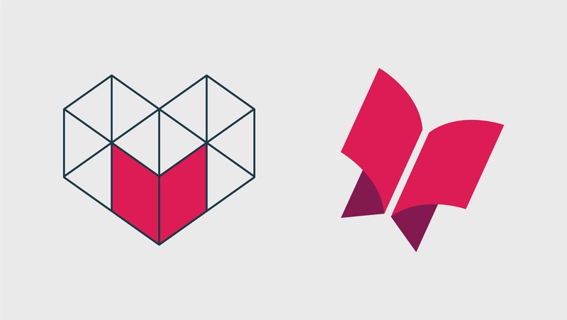
The Cornerstone logomark depicts an open book at the corner of a foundational structure, to suggest the integral need for humanities in foundational education. The overall structure also depicts an abstract heart shape, which echoes the essence of humanities teachings.
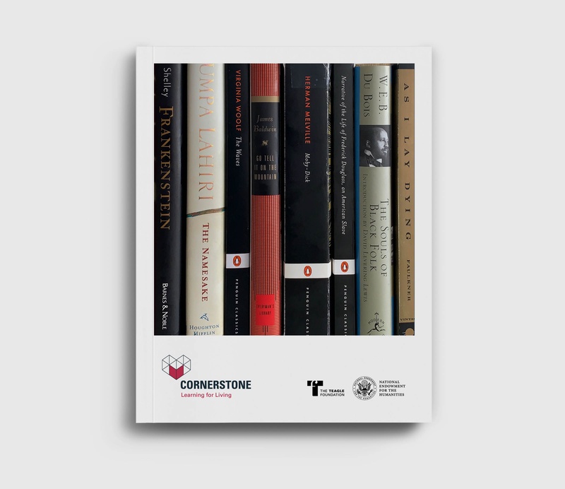
In Cornerstone programs, students can engage with challenging and inspiring works of literature, art, and philosophy in order to broaden their understanding of the world and themselves while strengthening the skills to read closely, write clearly, speak with confidence, and contend with differing viewpoints and perspectives.
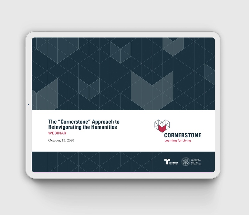
The mark also becomes the geometry for abstract patterns that can be deployed in various visual applications.

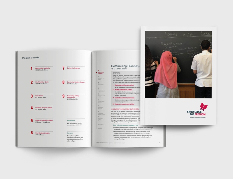
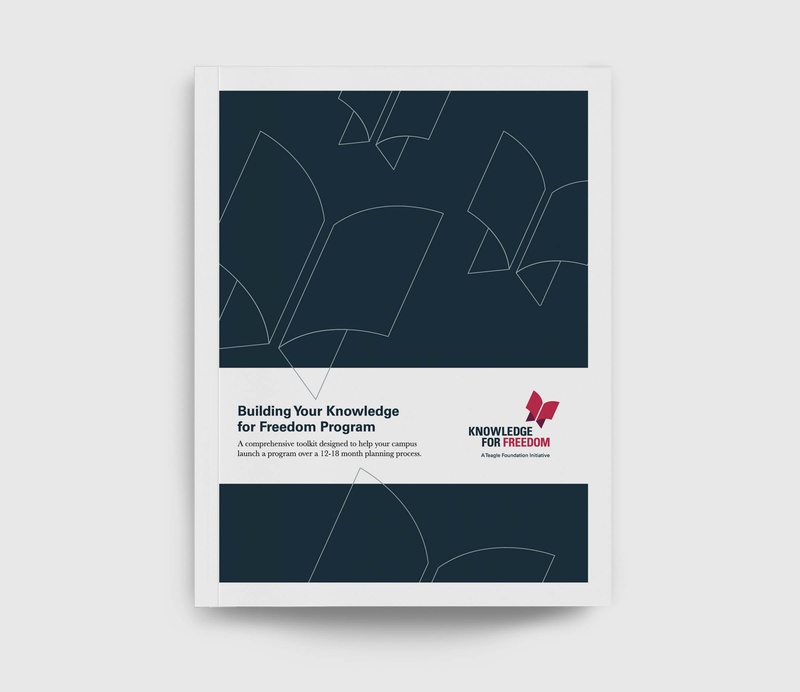
The second Teagle branded initiative, Knowledge for Freedom, involves partnerships with several universities. The program provides toolkits and support for higher-education institutions to start programs for underserved high school students. The program invites them to study enduring works of literature and philosophy that raise deep questions about civic responsibility.
The logomark depicts both an open book and a butterfly, to suggest that liberal arts open up opportunities for students that allow them to fly. The mark, paired with condensed typography and a bright beet red color, creates a striking logo with a youthful but sincere appearance.
The pair of brand identities align visually and typographically with the C&G-designed Teagle brand identity and website, as well as other Foundation initiatives.