![C&G Partners [logo]](https://www.cgpartnersllc.com/wp-content/uploads/2025/09/CGP20_black_orange_RGB.png)

A logo built of two letters at once, for an organization advancing innovation in liberal arts curricula.![]()
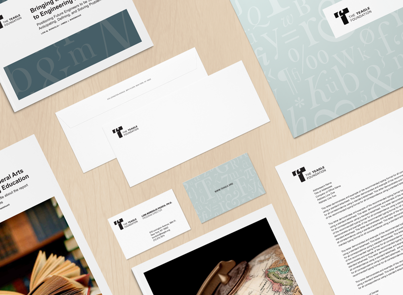
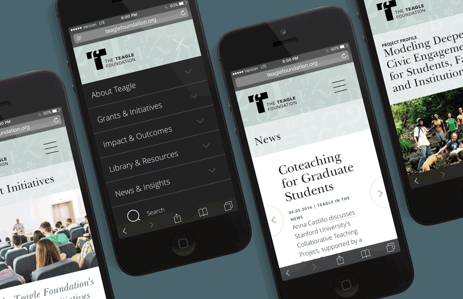
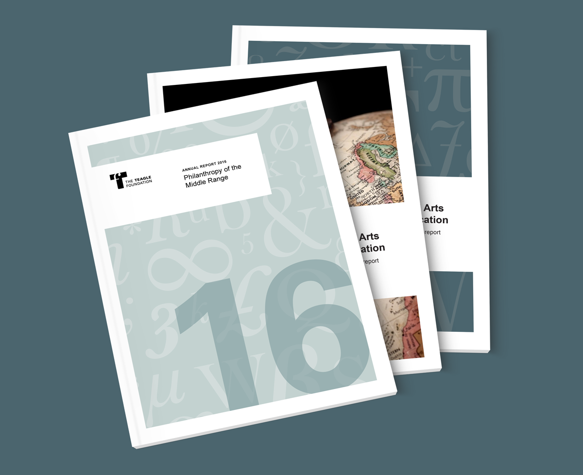
The Teagle Foundation rebrand conveys the organization’s mission of advancing liberal arts education, as well as the value it places on collaborating with grantees. The resulting logo is a strong, sans-serif uppercase ‘T’ with a delicate lowercase serif ‘f’ cut out of it locked in with the foundation name. The design is based on the concept of bridging traditional academic value systems with future-forward problem solving for the liberal arts facilitated by the Teagle Foundation. The duality of the two fonts in the logo strongly anchors the institution’s namesake while simultaneously referencing the future of liberal arts field. The finished logo is distinct yet simple and recognizable. Premised on the strength and legacy of the Teagle name, the rebrand is modern enough to complement the foundation’s quest to enhance the future of liberal arts education.
To accompany the logo mark lockup is a set of serene patterns developed from a building block of the liberal arts: language. Letters, numerals, and symbols, used in a contemporary and timeless fashion, signify various facets of the liberal arts; while the collaboration between Teagle and its grantees is portrayed through the delicate interplay of letters.