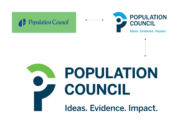
Founded by John D. Rockefeller, the Population Council is a global non-profit that conducts biomedical, social science, and public health research in over 50 countries. The organization outgrew their previous visual identity, and needed a way to communicate more effectively. 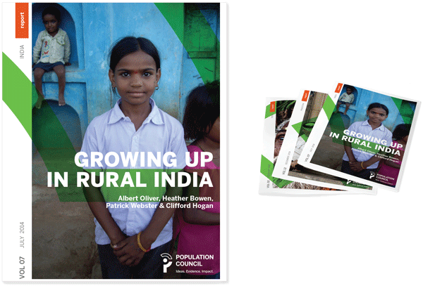 C&G was asked to create publication architecture that harnessed their new look and feel while developing a system for visual consistency and ease of reproduction. In addition to adjustments to the color, typeface, and form of the new identity, we also created a distinctive one-color version.
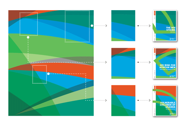
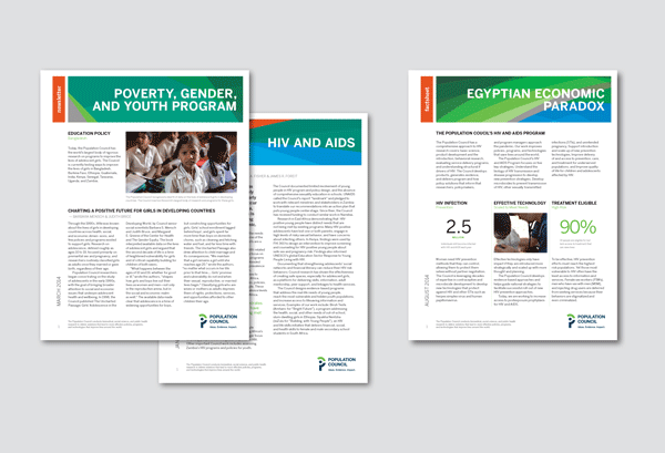
The Council wanted the publication designs to highlight the new identity and tagline. The final design solution is based on the “Population Council Arc” — the top portion of the new logomark — which reflects progress, growth and data.
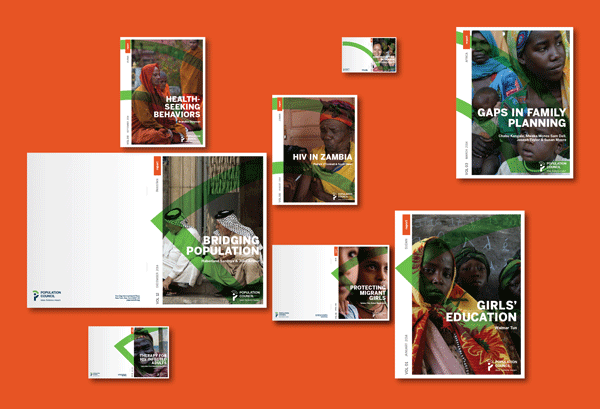 With its many global offices, the Population Council combats production limitations that demanded standardization of paper sizes, and a purposeful engagement with the paper’s edges, knowing for example that most office printers do not allow for full-bleed printing.
  In addition to designing Population Council’s publication architecture and identity, C&G also created an internal brand website to coincide with the release of the new logo. The website harnesses the same design element as its publication. C&G also created made a short logo animation to debut the logo and tagline. Population Council Brand Animation from C&G Partners on Vimeo.
![C&G Partners [logo]](https://www.cgpartnersllc.com/wp-content/uploads/2025/09/CGP20_black_orange_RGB.png)

