![C&G Partners [logo]](https://www.cgpartnersllc.com/wp-content/uploads/2025/09/CGP20_black_orange_RGB.png)

Historic arches become palm trees, rebranding the organization that preserves Palm Beach. 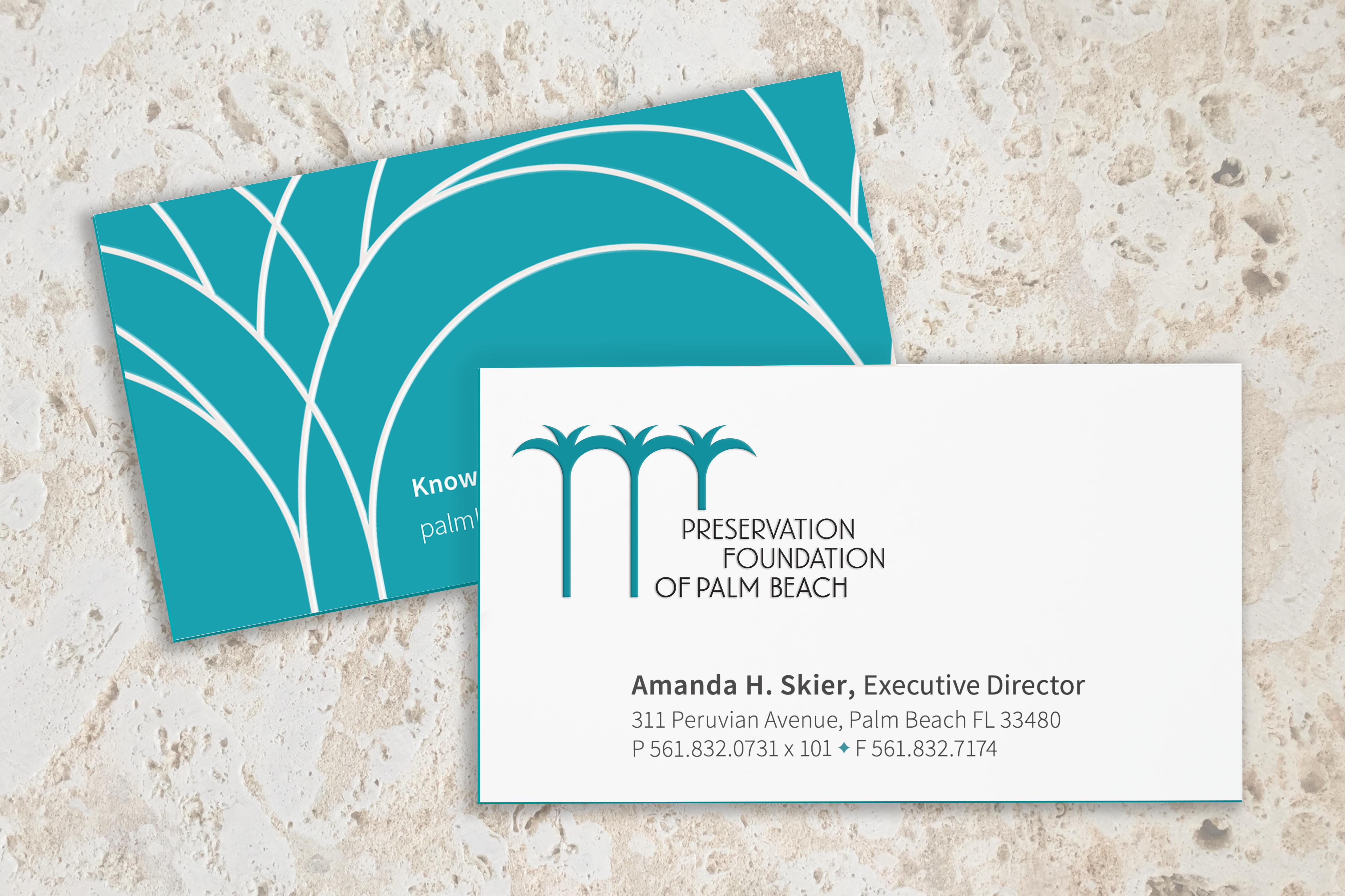
![]()
The new branding for the Preservation Foundation of Palm Beach utilizes the form of the iconic palm tree, yet has been carefully crafted and repeated to create arches that are a unique element in the historic architecture of Palm Beach.
This visual play of dual meaning is a tribute to the harmony between nature and historic architecture that is native to Palm Beach. It also refers to the idea that preservation not only honors a rich historic past but also brings vitality to nourish a future of growth and communal bonding. The staggered typographic lock-up is integrated with this graphic, as an echo of moving waves that are elements of the oceanside landscape.
The typeface ‘Landmark’ was selected as the primary typeface and modified to pay tribute to the letter forms drawn by iconic Palm Beach architect Addison Mizner in his architectural drawings.
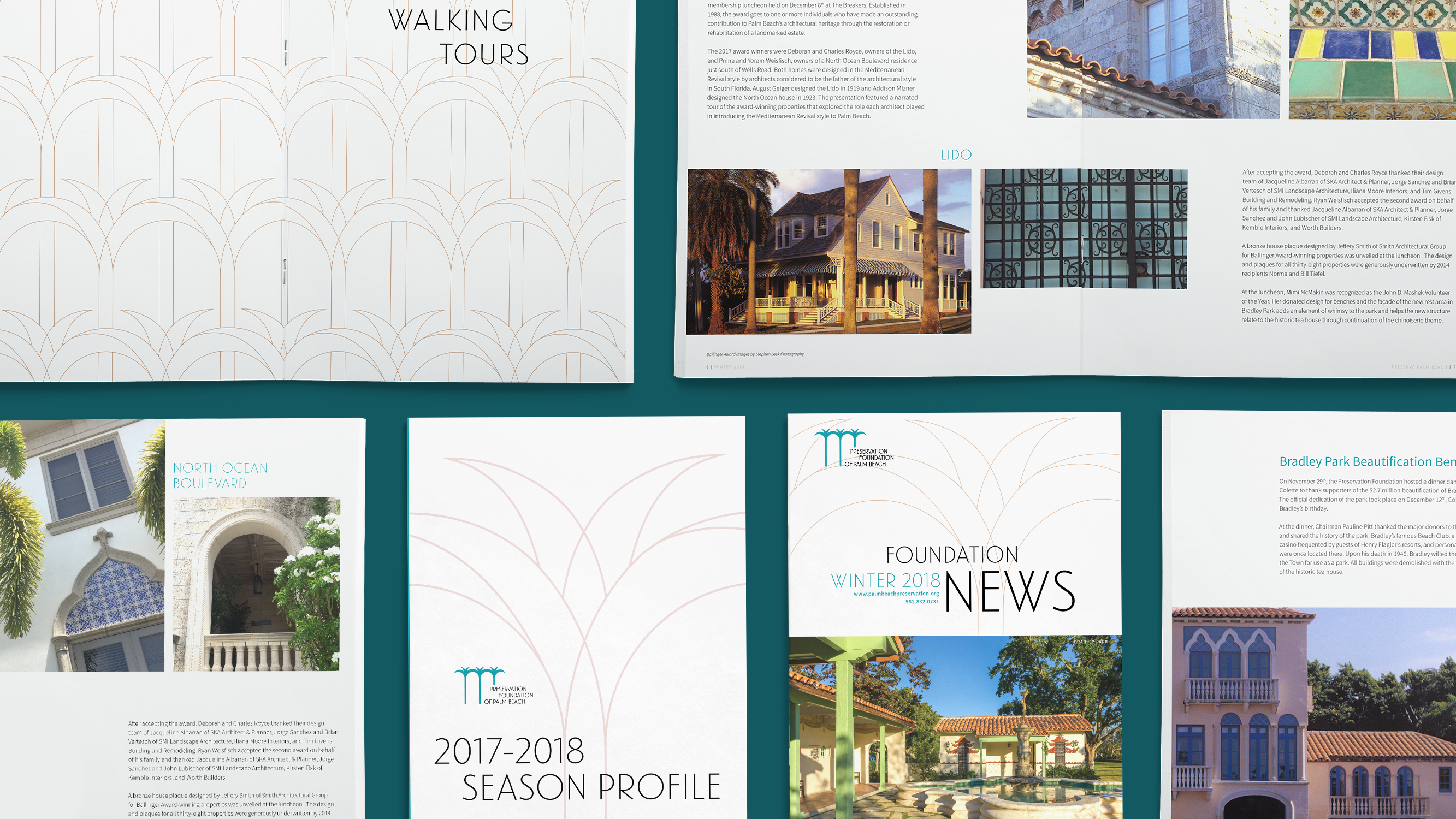
An intricate palm graphic, used as a secondary element, is made from intersecting lines, which echoes the ironwork throughout the architecture of Palm Beach. It is depicted in a sand color to complement the green-teal of the palm logo.